- FREE DELIVERY ON ORDERS OVER R1000
- Working Hours: Monday - Friday: 9am - 4:30pm

We don't currently stock , but our team can help.
Leave your details and we'll send you some options.
✓ Thanks! We'll be in touch with options shortly.
We don't currently stock , but our team can help.
Leave your details and we'll send you some options.
✓ Thanks! We'll be in touch with options shortly.
EXCELLENT Based on 403 reviews
 Posted on Google

 Eleni SiebertProduct quality is exceptional, service is excellent and turn-around time is amazing!! Thank you so much! I will definitely make use of your company again!!Posted on Google
 Kerry Wilson
Trustindex verifies that the original source of the review is Google.
Great to recive affordable samples that gave clear picture of colours and patternsPosted on Google Mike BoldingVery happy with wallpaper received.Posted on Google
 Katherine KirkbrideWe have used them for two separate projects and customer service on each project was extremely good.Posted on Google
 Wilmari Van HeerdenWhat an awsome experience, super efficient and great quality. Thank you !!Posted on Google
 Nikhil ParshotamSuper easy to order online. Quick delivery. Instructions on how to DIY. Happy customerPosted on Google
 Lesley BestExcellent service and product! A very user-friendly site and super effective communication. The whole process was a joy from start to finish!Posted on Google
 A - catI used the peel and stick wallpaper to cover some lasercut mdf boxes I had made. I really liked the paper texture (kozo?) and it was incredibly easy to work with and match patterns where I wrapped around the boxes. The order and delivery process was also good and quite fast (I received the paper before the boxes arrived from lasercutting people). I think I might need to tackle a wall to match my little boxes now :)Posted on Google
 Sam de JagerAwesome service. Quick and friendly.
from
R289.00 incl.
| Panel Width | 50 cm |
|---|---|
| Panel Length | 980 cm |
| Application Method | DuraMatte Fabric: Requires wallpaper glue or paste, Peel and Stick: Self Adhesive-peel off backing Traditional: Requires wallpaper glue or paste |
| Washability | DuraMatte Fabric: Can be washed with warm water, gentle soap and a soft cloth., Peel and Stick: Can be washed with warm water, Traditional: Can be wiped. |
| SKU | 217967562-1 |
| Shipping Weight | 2 kg |
| Category | Animal Wallpapers, Bedroom Wallpaper, Bird Wallpaper, Grey Wallpaper, Pink Wallpaper, Wallpaper |
| Manufactured | South Africa |
EXCELLENTBased on 403 reviewsPosted on GoogleEleni SiebertProduct quality is exceptional, service is excellent and turn-around time is amazing!! Thank you so much! I will definitely make use of your company again!!Posted on GoogleKerry WilsonGreat to recive affordable samples that gave clear picture of colours and patternsPosted on GoogleMike BoldingVery happy with wallpaper received.Posted on GoogleKatherine KirkbrideWe have used them for two separate projects and customer service on each project was extremely good.Posted on GoogleWilmari Van HeerdenWhat an awsome experience, super efficient and great quality. Thank you !!Posted on GoogleNikhil ParshotamSuper easy to order online. Quick delivery. Instructions on how to DIY. Happy customerPosted on GoogleLesley BestExcellent service and product! A very user-friendly site and super effective communication. The whole process was a joy from start to finish!Posted on GoogleA - catI used the peel and stick wallpaper to cover some lasercut mdf boxes I had made. I really liked the paper texture (kozo?) and it was incredibly easy to work with and match patterns where I wrapped around the boxes. The order and delivery process was also good and quite fast (I received the paper before the boxes arrived from lasercutting people). I think I might need to tackle a wall to match my little boxes now :)Posted on GoogleSam de JagerAwesome service. Quick and friendly.
| Weight | 2 kg |
|---|---|
| Dimensions | 980 × 50 cm |
| Materials Available | DuraMatte Fabric Wallpaper, Peel & Stick, Traditional Non-Woven Wallpaper |
| Is this wallpaper removable? | chipping and damage might occur. The traditional requires cutting, soaking and scraping to remove., The peel & stick materials are removable ( smooth matte peel and stick and KOZO. The DuraMatte will come off in one piece but dependant on paint and glue strength |
| Bathroom Friendly? | DuraMatte Fabric: Yes, Peel & Stick: Yes, Traditional: No |
| Application | DuraMatte Fabric: Requires wallpaper glue or paste, Peel and Stick: Self Adhesive-peel off backing Traditional: Requires wallpaper glue or paste |
| Delivery | 4-5 Working days for manufacturing and then approximately 2 working days for courier. |
| Pattern Repeat | Each panel comes in 60cm wide or 1.1m (wide format) panels. |
| Texture / Finish | DuraMatte Fabric: cotton canvas fabric texture / off white grey hue, Peel and Stick: soft touch matte / pure white., Traditional: paper matte / off white warm hue. |
| Washability | DuraMatte Fabric: Can be washed with warm water, gentle soap and a soft cloth., Peel and Stick: Can be washed with warm water, Traditional: Can be wiped. |
| Country of Origin | All wallpapers made in South Africa |
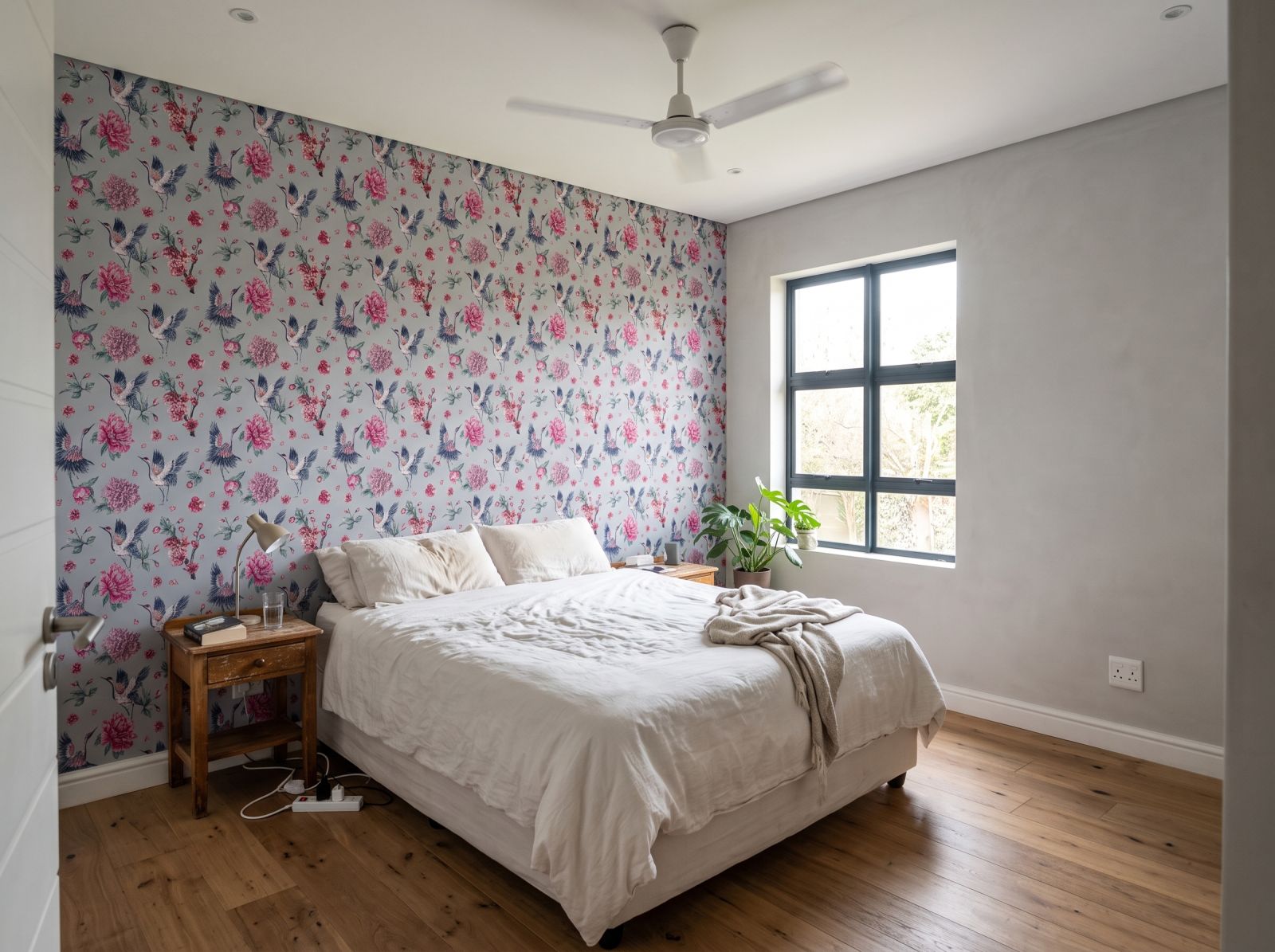
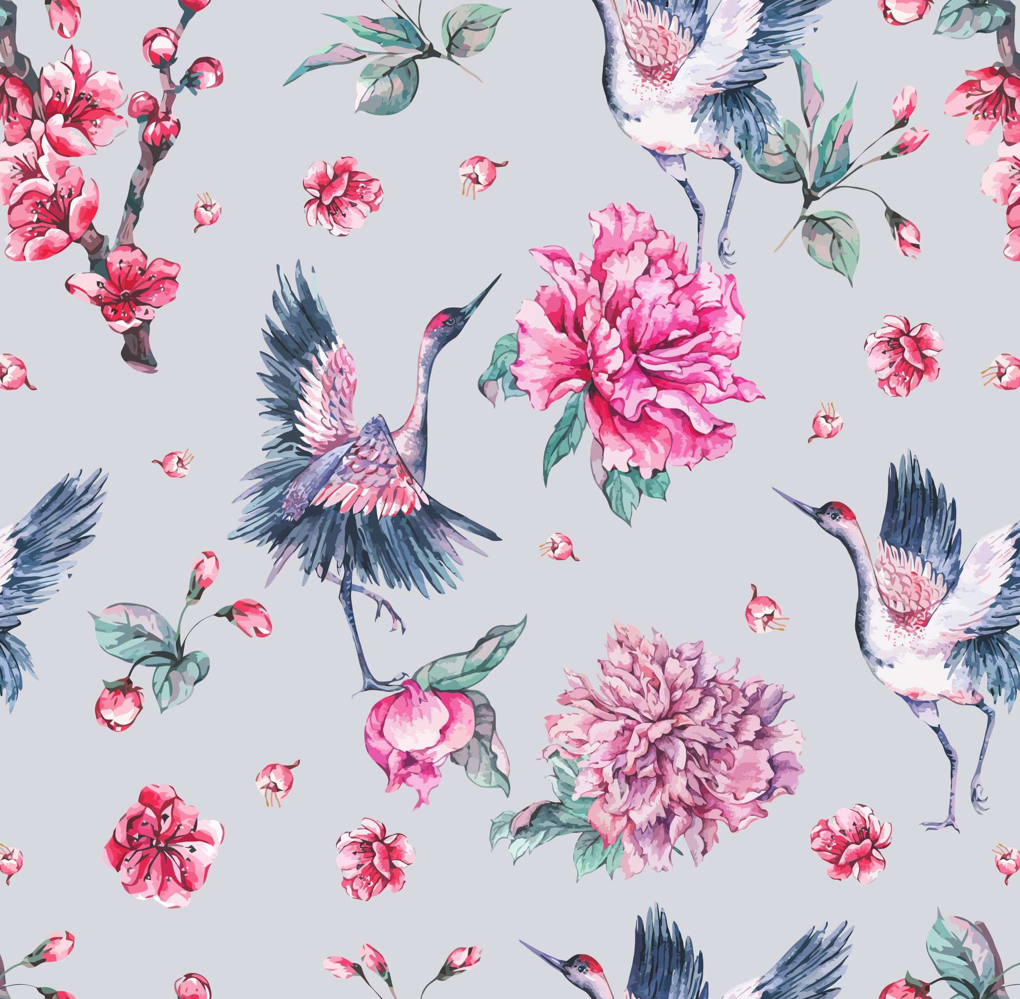
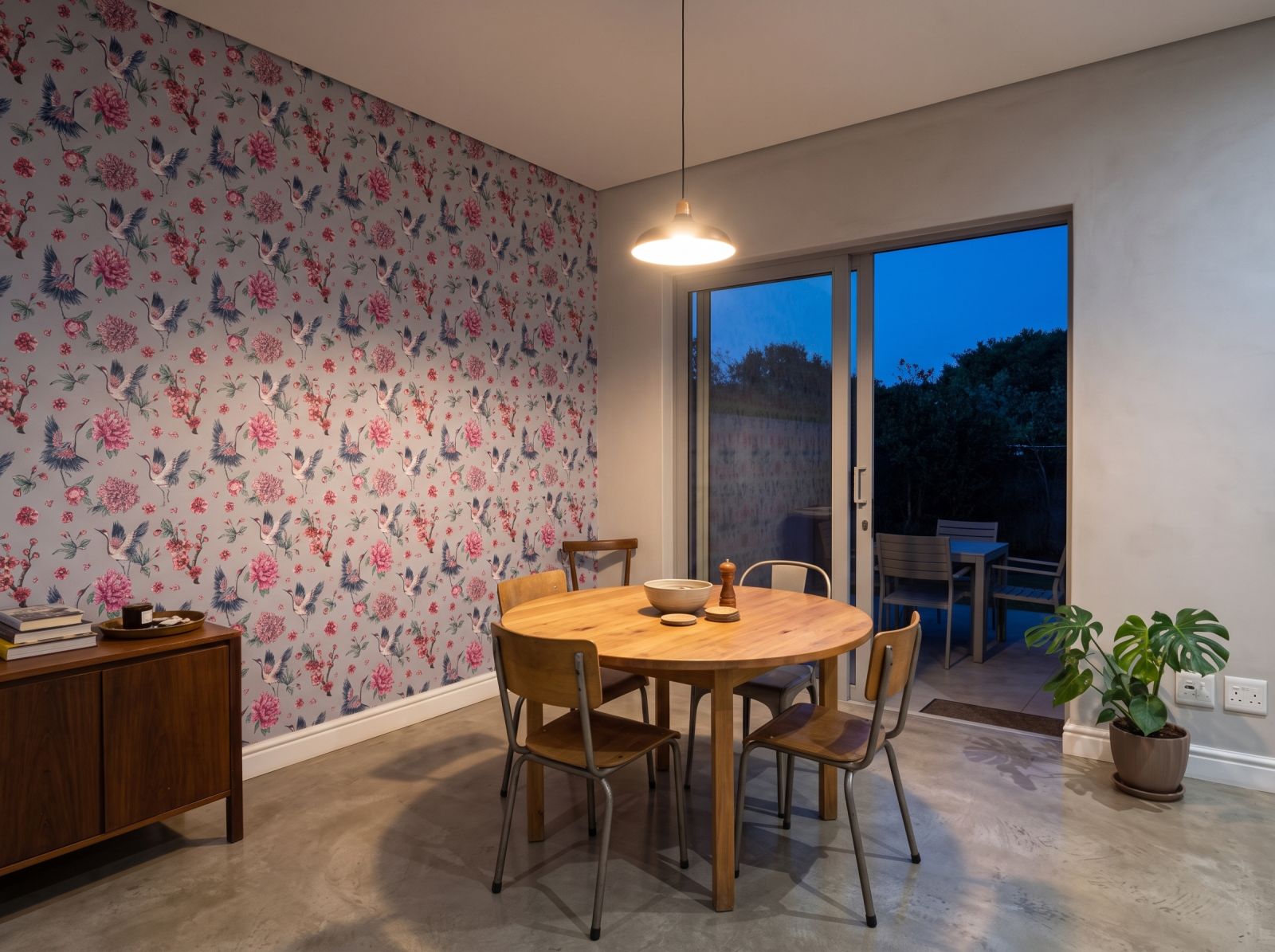
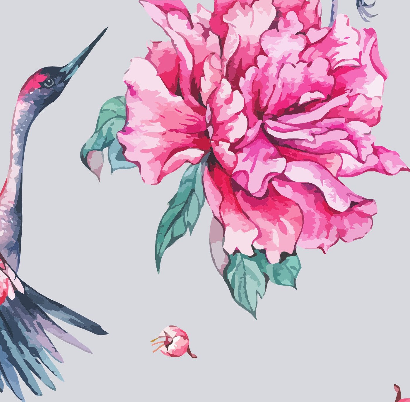
The design sits on a pale dove-grey ground with soft blush pink peonies and blossoms, balanced by slate blue-grey crane plumage. Under the hard, bright daylight common on the Highveld, this kind of saturated pink against blue-grey holds its depth rather than washing out, while the pale grey keeps the overall effect airy rather than heavy.
The cranes and peonies are drawn at a large scale, so only a few repeats are needed to fill a wall and the motif reads clearly from across a room. It works best as a single feature wall rather than wrapping right around a space, letting the birds and blooms stay legible rather than crowded.
Its soft pinks and formal, oriental-inspired figures suit a bedroom or dining room feature wall, though it also reads well in a hallway where guests pass it at a distance. Pair it with plain painted walls elsewhere in the room, timber or linen furnishings, and keep other patterns to a minimum so the cranes remain the focus.
Yes. The panels are numbered when printed, and hanging them in that order from one edge of the wall across keeps the peonies, blossoms and crane figures aligned at each seam. Unrolling and numbering the drops as you go, then working left to right, is the simplest way to keep the sequence correct.
A motif of this scale needs a little more trimming than a small, dense pattern to bring the repeat into alignment at the ceiling and skirting. This is allowed for when the order is printed to your wall measurements, so it doesn't affect how the finished wall looks, only the amount cut to get there.
| Weight | 2 kg |
|---|---|
| Dimensions | 980 × 50 cm |
| Materials Available | DuraMatte Fabric Wallpaper, Peel & Stick, Traditional Non-Woven Wallpaper |
| Is this wallpaper removable? | chipping and damage might occur. The traditional requires cutting, soaking and scraping to remove., The peel & stick materials are removable ( smooth matte peel and stick and KOZO. The DuraMatte will come off in one piece but dependant on paint and glue strength |
| Bathroom Friendly? | DuraMatte Fabric: Yes, Peel & Stick: Yes, Traditional: No |
| Application | DuraMatte Fabric: Requires wallpaper glue or paste, Peel and Stick: Self Adhesive-peel off backing Traditional: Requires wallpaper glue or paste |
| Delivery | 4-5 Working days for manufacturing and then approximately 2 working days for courier. |
| Pattern Repeat | Each panel comes in 60cm wide or 1.1m (wide format) panels. |
| Texture / Finish | DuraMatte Fabric: cotton canvas fabric texture / off white grey hue, Peel and Stick: soft touch matte / pure white., Traditional: paper matte / off white warm hue. |
| Washability | DuraMatte Fabric: Can be washed with warm water, gentle soap and a soft cloth., Peel and Stick: Can be washed with warm water, Traditional: Can be wiped. |
| Country of Origin | All wallpapers made in South Africa |
EXCELLENTBased on 403 reviewsPosted on GoogleEleni SiebertProduct quality is exceptional, service is excellent and turn-around time is amazing!! Thank you so much! I will definitely make use of your company again!!Posted on GoogleKerry WilsonGreat to recive affordable samples that gave clear picture of colours and patternsPosted on GoogleMike BoldingVery happy with wallpaper received.Posted on GoogleKatherine KirkbrideWe have used them for two separate projects and customer service on each project was extremely good.Posted on GoogleWilmari Van HeerdenWhat an awsome experience, super efficient and great quality. Thank you !!Posted on GoogleNikhil ParshotamSuper easy to order online. Quick delivery. Instructions on how to DIY. Happy customerPosted on GoogleLesley BestExcellent service and product! A very user-friendly site and super effective communication. The whole process was a joy from start to finish!Posted on GoogleA - catI used the peel and stick wallpaper to cover some lasercut mdf boxes I had made. I really liked the paper texture (kozo?) and it was incredibly easy to work with and match patterns where I wrapped around the boxes. The order and delivery process was also good and quite fast (I received the paper before the boxes arrived from lasercutting people). I think I might need to tackle a wall to match my little boxes now :)Posted on GoogleSam de JagerAwesome service. Quick and friendly.

Exclusive to Wallpaper Online the new ARTEX art canvas textured peel & stick gives artistic masterpiece energy to any space. -Commercial grade, textured PVC self adhesive wallpaper. -Waterproof & washable. -Repositionable & removable (DIY friendly).

- Commercial grade, textured PVC self adhesive wallpaper. -Waterproof & washable. - Repositionable & removable.
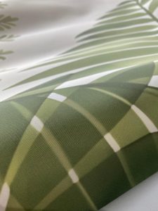
- Commercial grade fabric wallpaper. - Waterproof and washable. - Requires glue to apply.

- Soft touch smooth matte texture. - Peel & stick / self-adhesive wallpaper with backing paper (like a big sticker). - Waterproof & washable. -

- Traditional non-woven paper wallpaper. - Wipe-able but not waterproof or washable. - Requires glue to apply.
Enter the size of the wall you are covering in centimetres.
Please add 10 cm to both width and height for flexibility during installation.
Free room visualiser · 30 seconds · no sign-up
Get a 60 cm wide swatch of this design before ordering a full wall.
Not quite the one?
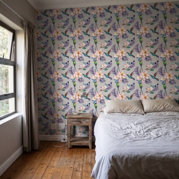
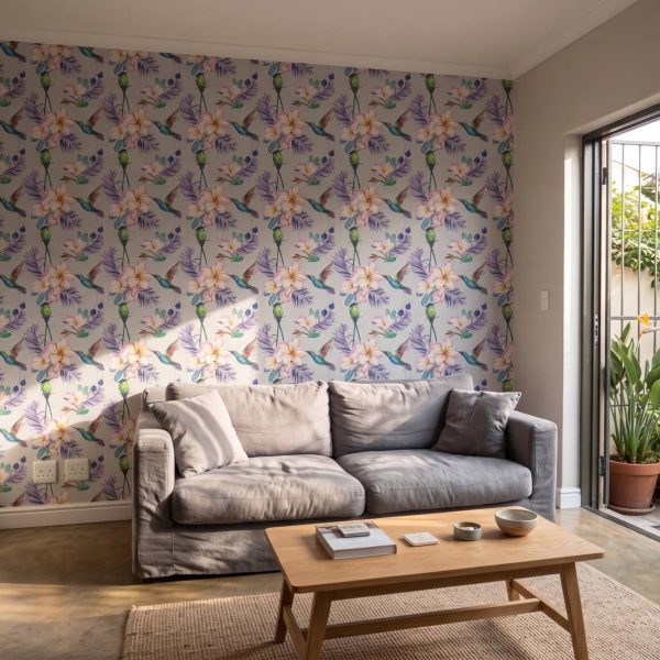 Gentle Hume Wallpaper
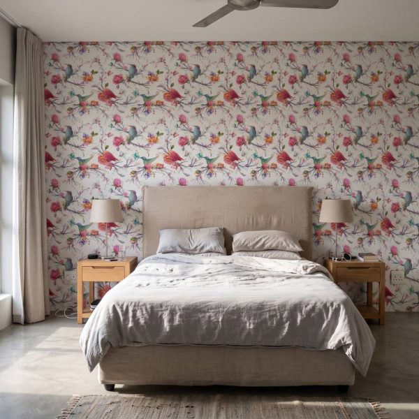
 Sheen Quill Spring Wallpaper
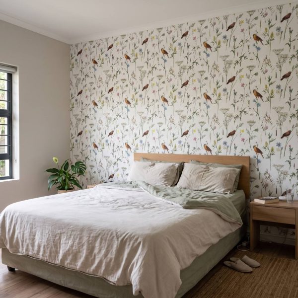
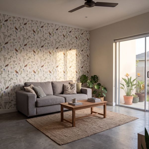 Soaring Sprig Wallpaper
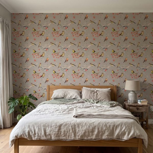
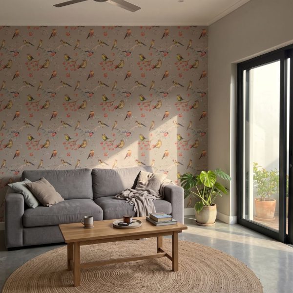 Feathered Friends Smoke Wallpaper
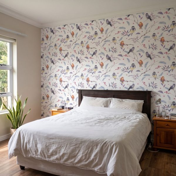
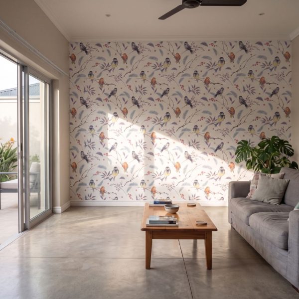 Winter Birds & Berries Wallpaper
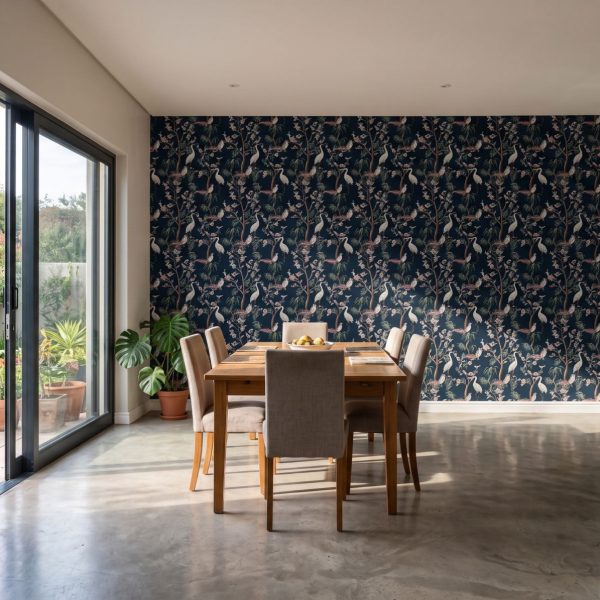
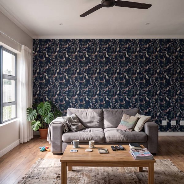 Zircon Designer Stork Wallpaper
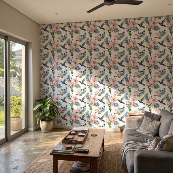
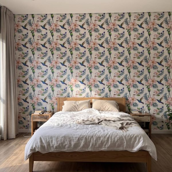 Soft Hume Wallpaper
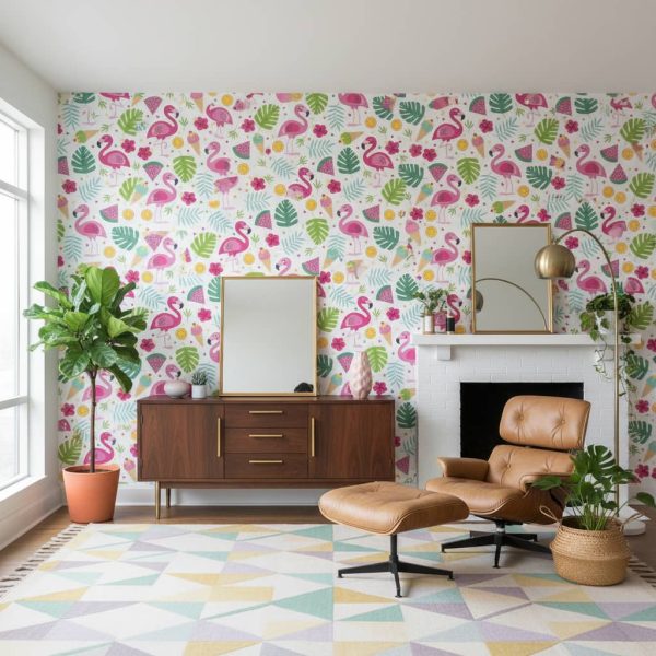
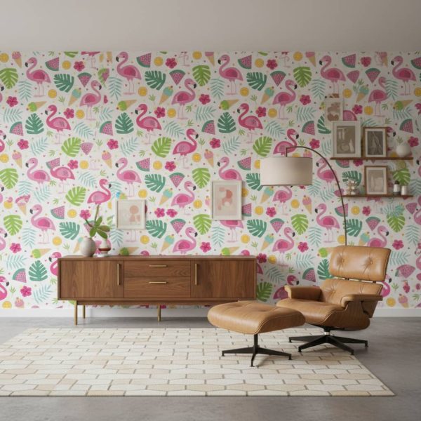 Pretty Parade Wallpaper
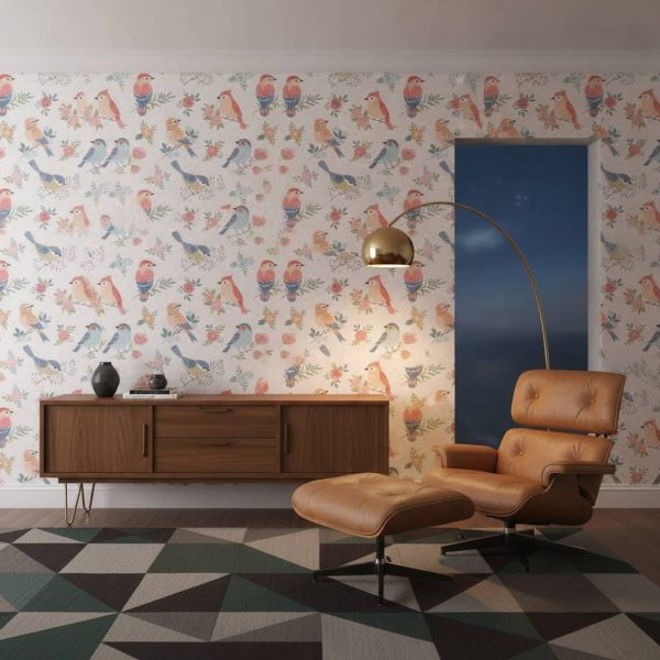
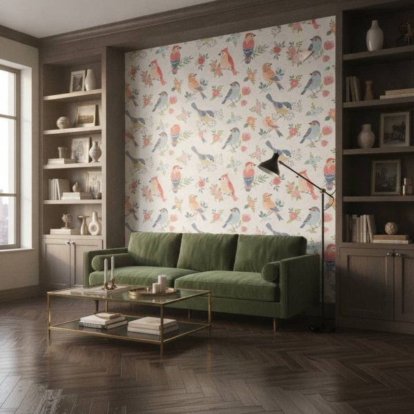 Birds of a Feather Wallpaper
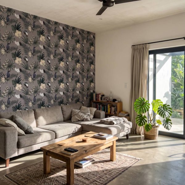
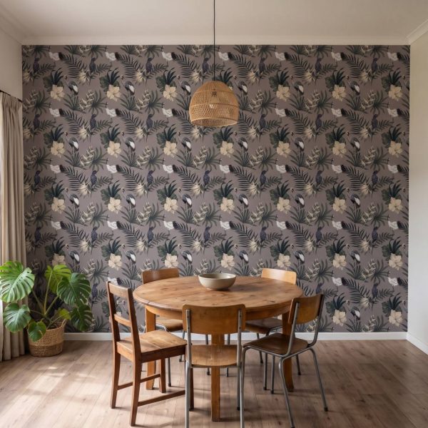 Black Tea Flights Wallpaper
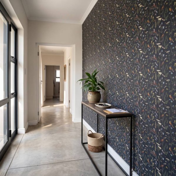
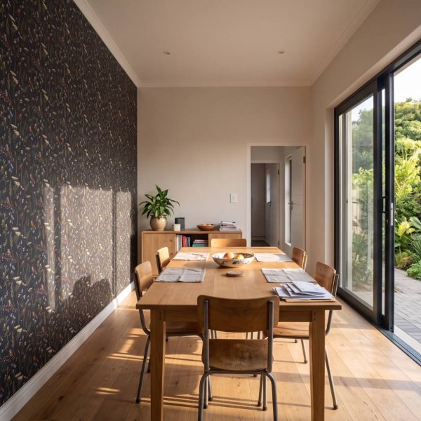 Drift Designer Wallpaper
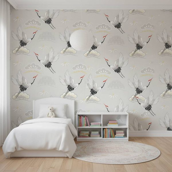
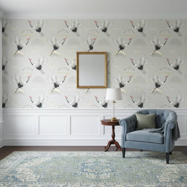 Violaceae Crane Wallpaper
We recommend adding 10 cm to both width and height for trim flexibility.
Receive a 60 cm wide sample of this design printed on your selected material. Perfect for checking the colour, texture, and quality before ordering your full wall.
Don't worry about being exact — we produce custom sizes so you'll get a perfect fit!
We've saved the room photo you used earlier — try this design in it.
We'll render this design in your space — photo-realistic, at correct scale.
JPG, PNG, WebP up to 12 MB · Result ready in 6–12 seconds
We're composing your design at the correct scale. This usually takes 6–12 seconds.
You've used your 3 free renders today. Pop in your details to unlock 7 more renders across any design, and we'll send today's previews straight to your inbox.

Reviews
There are no reviews yet.