Cream & Neutral Wallpaper

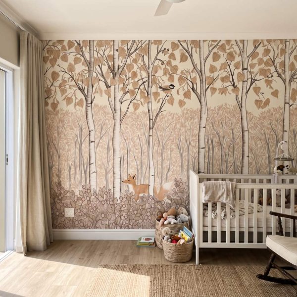
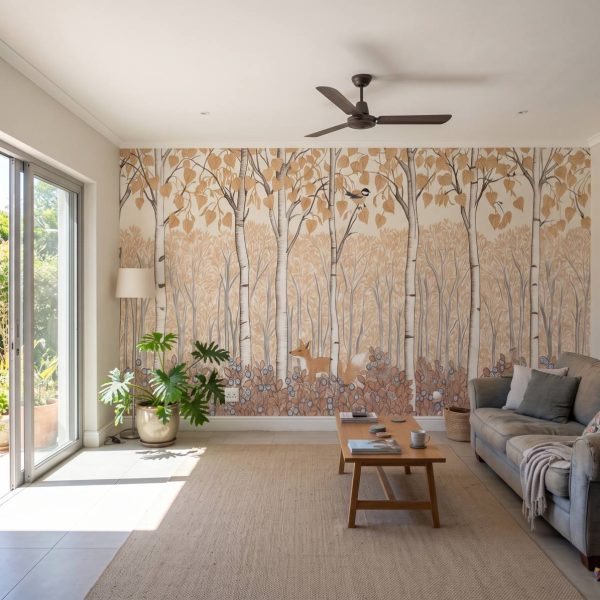
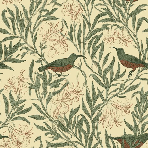
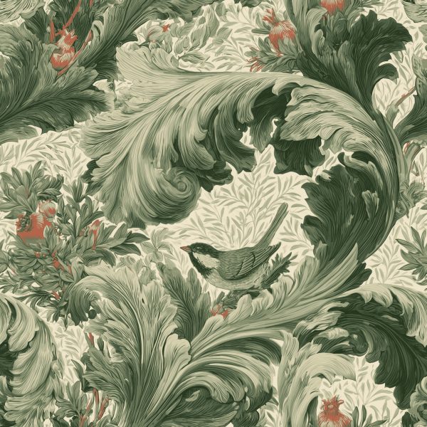
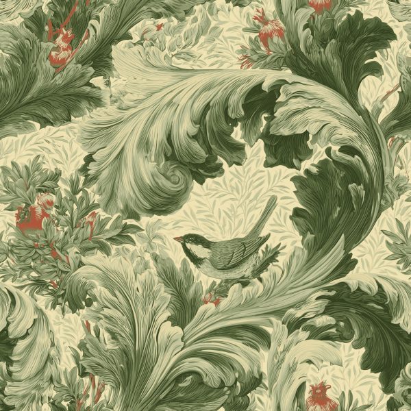
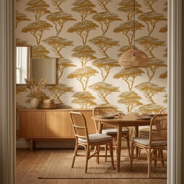
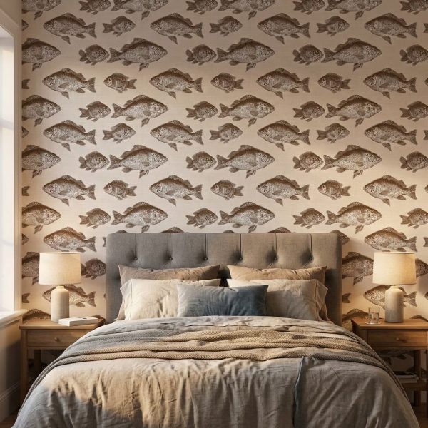
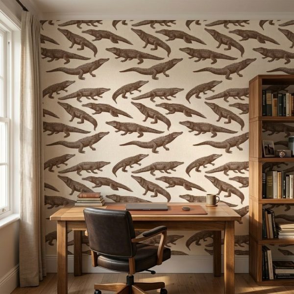
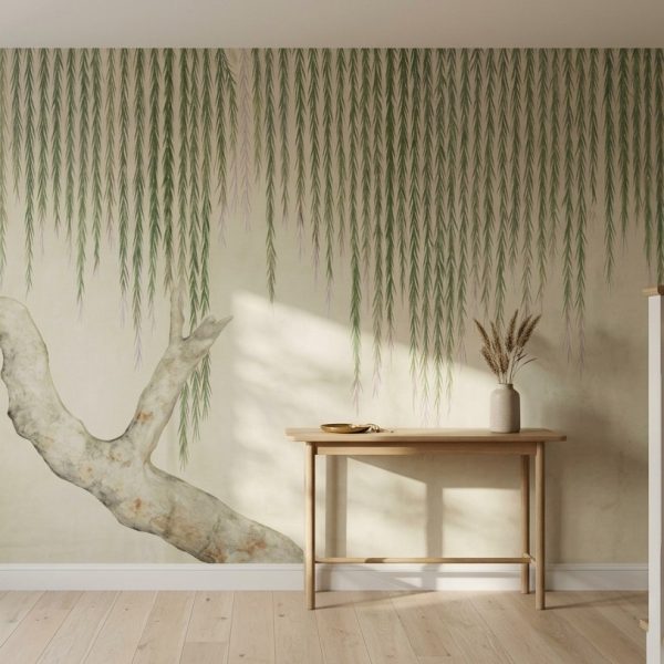
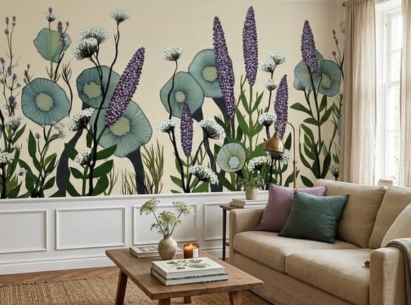
Cream wallpaper gives you all the calm of a neutral with far more warmth than plain white paint. This collection covers cream, beige, sand and greige in soft textures, linen and grasscloth looks, quiet florals, tonal damask and gentle geometrics, so you can add depth to a wall without adding noise. Warm neutrals sit happily beside timber floors, rattan, brass and terracotta, and they make a restful base for a bedroom, passage or open-plan lounge that you can layer with bolder cushions and art. Because cream can lean yellow in afternoon Highveld sun and greyer in a shaded room, preview the shade on your own wall in the room visualiser first. Pair it with sage green wallpaper for an earthy scheme, or browse damask and paisley designs for a classic look. Printed to order in Johannesburg in Peel & Stick or Traditional.


What is the difference between cream, beige and greige wallpaper?

Cream is a warm off-white with a hint of yellow. Beige is deeper and sandier. Greige blends beige with grey, so it reads cooler and more modern. All three are easy backdrops, but greige suits cooler-toned floors and furniture best.

Will neutral wallpaper make my room look boring?

Not if you choose texture or tonal pattern. Grasscloth and linen effects, subtle damask and soft geometrics add depth that flat paint can't, while keeping the room calm. Bring in contrast through timber, plants, art and textiles.

Is cream wallpaper practical in a home with kids or pets?

Lighter colours show marks more readily than mid-tones, so for busy passages and family rooms a patterned or textured cream hides everyday wear better than a plain one. Peel & Stick also lets you replace a damaged panel later.

What colours go well with cream wallpaper?

Cream works with almost anything. Sage and olive greens feel earthy, terracotta and rust feel warm, navy gives crisp contrast, and black accents add a modern edge. Natural timber, rattan and linen always sit comfortably against it.

FILTER BY COLOUR

Loading colours…

CATEGORIES