Which rooms suit red or burgundy wallpaper?
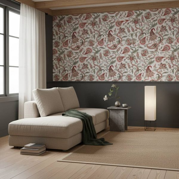
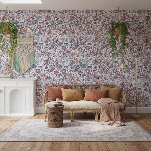
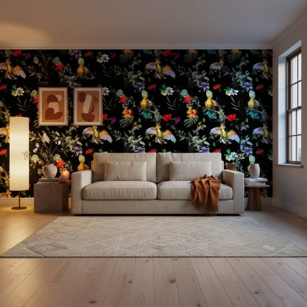
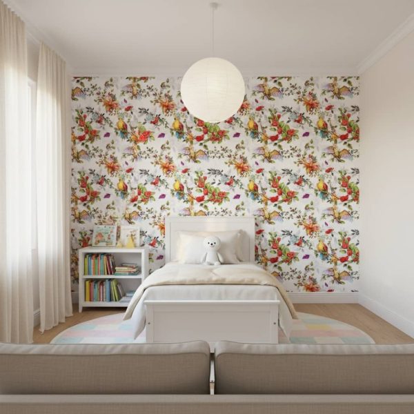
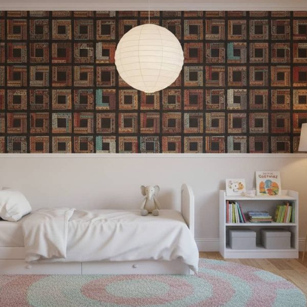
Deep burgundy, maroon and wine red are lovely in dining rooms, studies and main bedrooms, where they feel warm and intimate in the evening. Brighter crimson and scarlet work best in smaller doses, such as a passage, guest loo or a single feature wall, where a burst of energy is welcome.
Will dark red wallpaper make my room feel smaller?
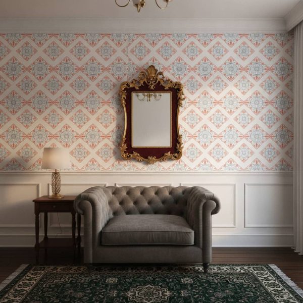
Dark red can make walls feel closer, but that usually reads as cosy rather than cramped. To keep a smaller room balanced, use it on one feature wall, choose a design with a lighter ground or a cream motif, and keep ceilings, trims and flooring lighter so the space still has contrast.
What colours go well with burgundy wallpaper?
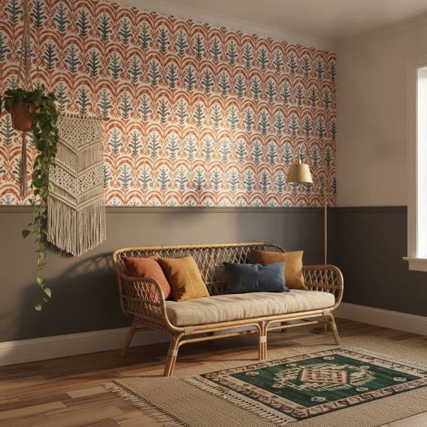
Burgundy pairs beautifully with cream, soft blush, warm wood and natural linen for a classic look. For something bolder, try deep green, navy or mustard accents. Greenery and terracotta pots bring out its earthy side, while crisp white trims make the red look cleaner and more contemporary.
What is the difference between burgundy, maroon and wine red?
They are all deep reds. Burgundy leans slightly purple, like red wine, and maroon leans brown, closer to oxblood or rust. Wine red is a broad term covering both. Look at each design in the room visualiser, because lighting and the colours around it will shift how warm or cool the red appears.