- FREE DELIVERY ON ORDERS OVER R1000
- Working Hours: Monday - Friday: 9am - 4:30pm

We don't currently stock , but our team can help.
Leave your details and we'll send you some options.
✓ Thanks! We'll be in touch with options shortly.
We don't currently stock , but our team can help.
Leave your details and we'll send you some options.
✓ Thanks! We'll be in touch with options shortly.


 Trustindex verifies that the original source of the review is Google.
 Trustindex verifies that the original source of the review is Google.
 Trustindex verifies that the original source of the review is Google.
 Trustindex verifies that the original source of the review is Google.
 Trustindex verifies that the original source of the review is Google.
 Trustindex verifies that the original source of the review is Google.
from
R289.00 incl.
| Panel Width | 50 cm |
|---|---|
| Panel Length | 980 cm |
| Application Method | DuraMatte Fabric: Requires wallpaper glue or paste, Peel and Stick: Self Adhesive-peel off backing Traditional: Requires wallpaper glue or paste |
| Washability | DuraMatte Fabric: Can be washed with warm water, gentle soap and a soft cloth., Peel and Stick: Can be washed with warm water, Traditional: Can be wiped. |
| SKU | 291453739-1 |
| Shipping Weight | 2 kg |
| Category | Floral Wallpaper, Bedroom Wallpaper, Blue & Navy Wallpaper, Living Room Wallpaper, Wallpaper |
| Manufactured | South Africa |
Trustindex verifies that the original source of the review is Google. Trustindex verifies that the original source of the review is Google. Trustindex verifies that the original source of the review is Google. Trustindex verifies that the original source of the review is Google. Trustindex verifies that the original source of the review is Google. Trustindex verifies that the original source of the review is Google. | Weight | 2 kg |
|---|---|
| Dimensions | 980 × 50 cm |
| Materials Available | DuraMatte Fabric Wallpaper, Peel & Stick, Traditional Non-Woven Wallpaper |
| Is this wallpaper removable? | chipping and damage might occur. The traditional requires cutting, soaking and scraping to remove., The peel & stick materials are removable ( smooth matte peel and stick and KOZO. The DuraMatte will come off in one piece but dependant on paint and glue strength |
| Bathroom Friendly? | DuraMatte Fabric: Yes, Peel & Stick: Yes, Traditional: No |
| Application | DuraMatte Fabric: Requires wallpaper glue or paste, Peel and Stick: Self Adhesive-peel off backing Traditional: Requires wallpaper glue or paste |
| Delivery | 4-5 Working days for manufacturing and then approximately 2 working days for courier. |
| Pattern Repeat | Each panel comes in 60cm wide or 1.1m (wide format) panels. |
| Texture / Finish | DuraMatte Fabric: cotton canvas fabric texture / off white grey hue, Peel and Stick: soft touch matte / pure white., Traditional: paper matte / off white warm hue. |
| Washability | DuraMatte Fabric: Can be washed with warm water, gentle soap and a soft cloth., Peel and Stick: Can be washed with warm water, Traditional: Can be wiped. |
| Country of Origin | All wallpapers made in South Africa |
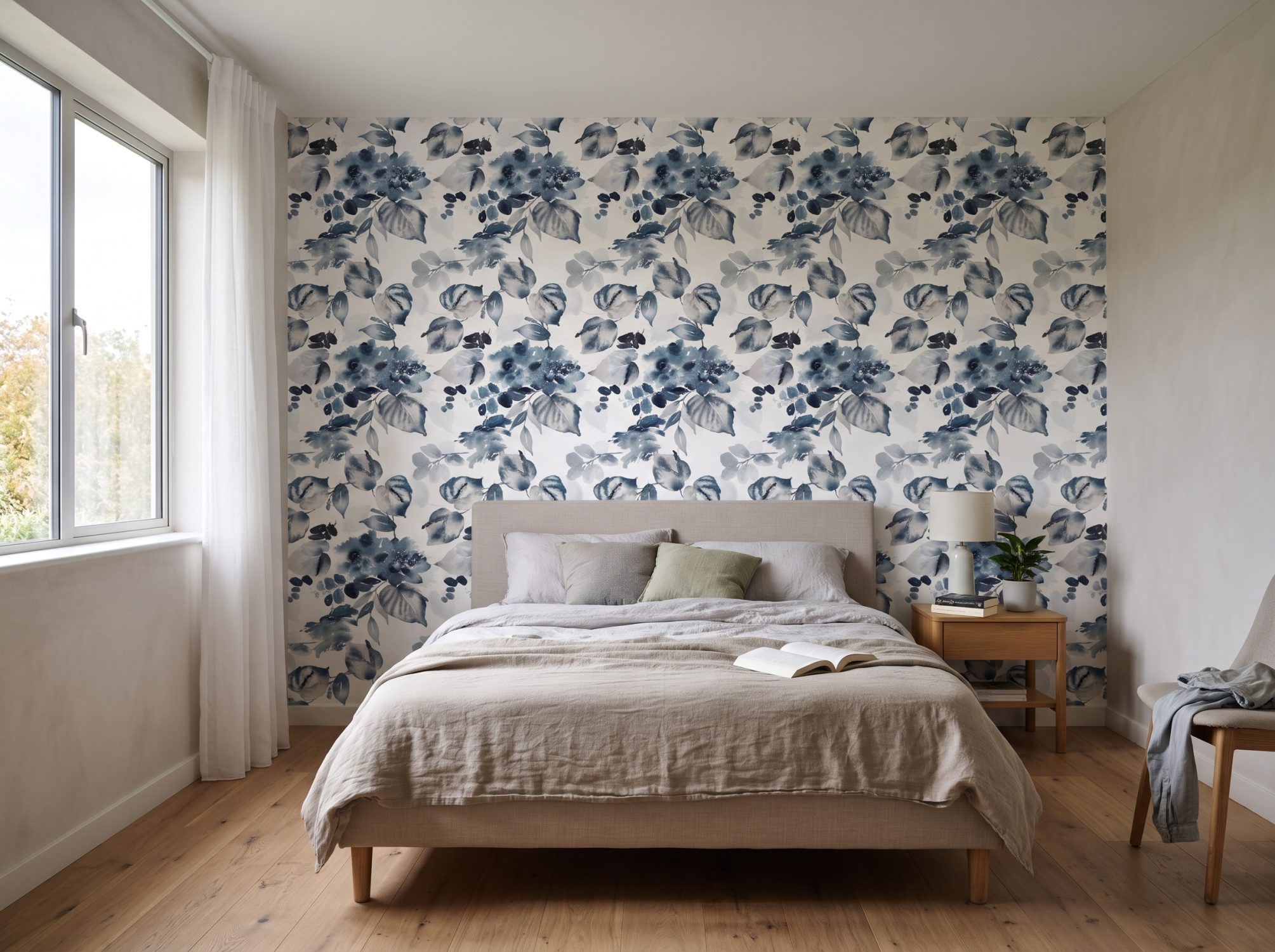
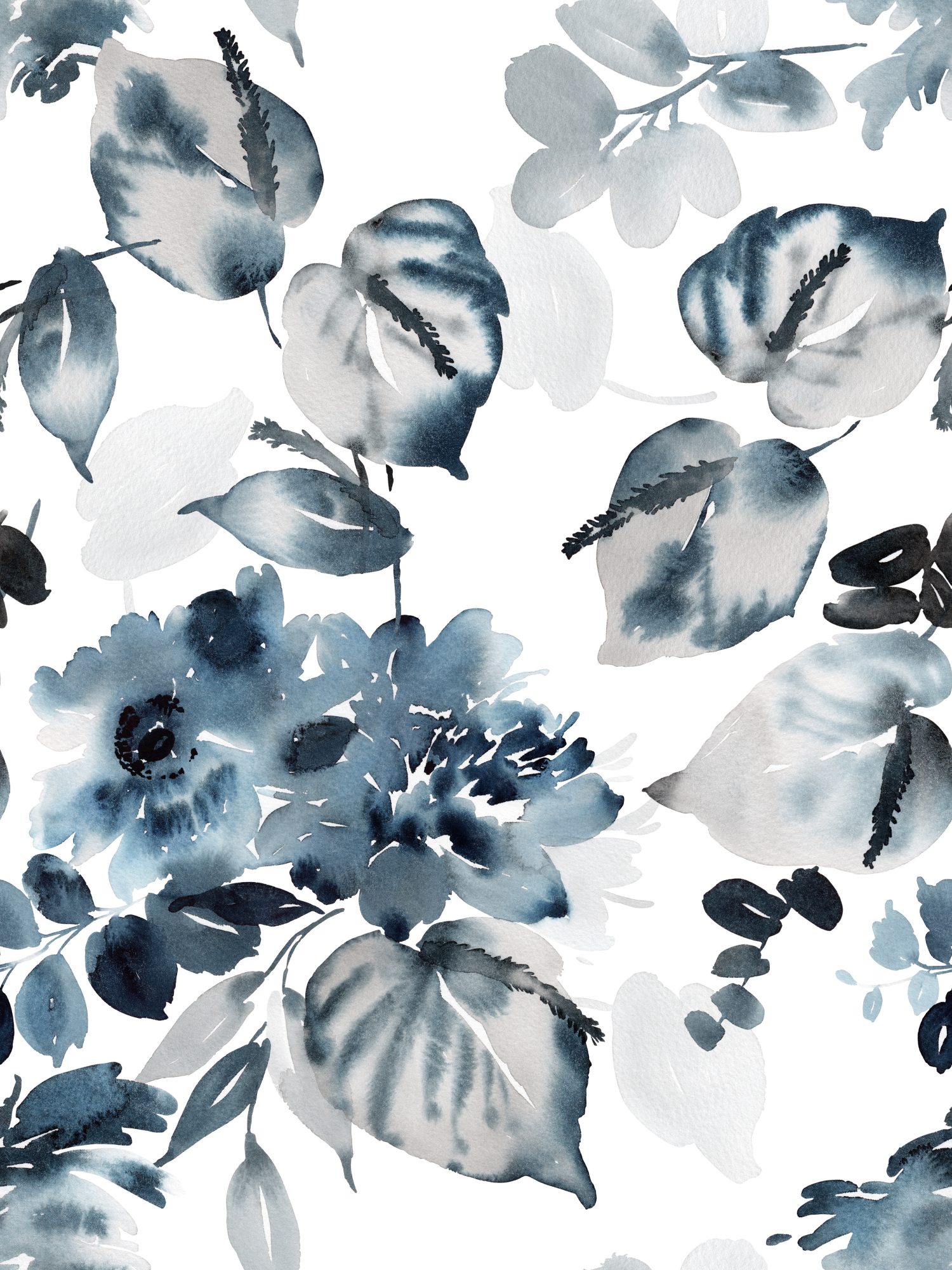
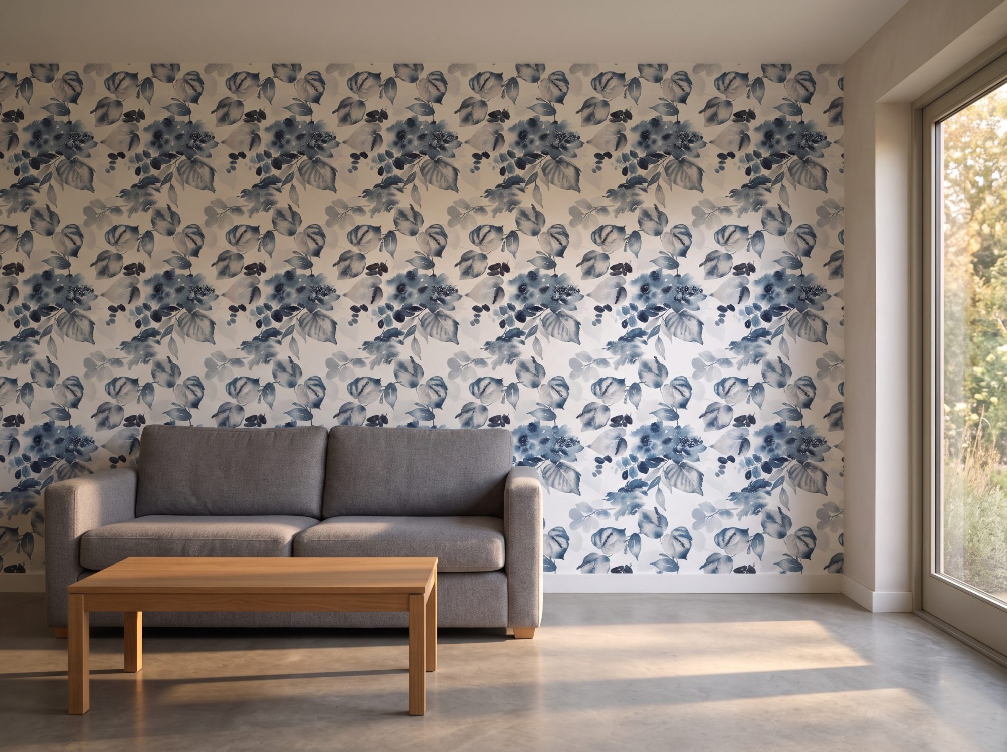
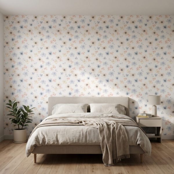
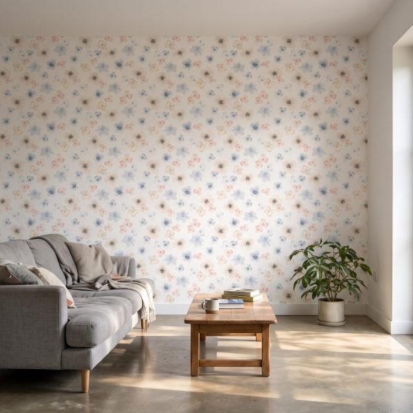
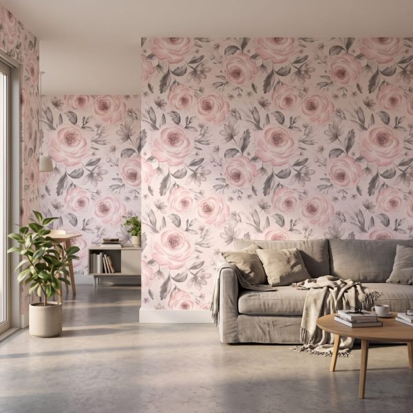
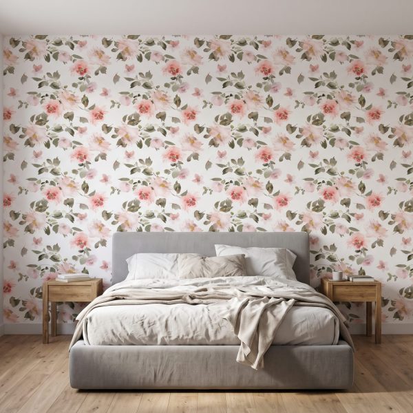
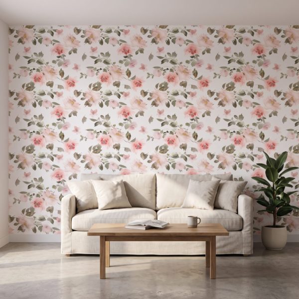
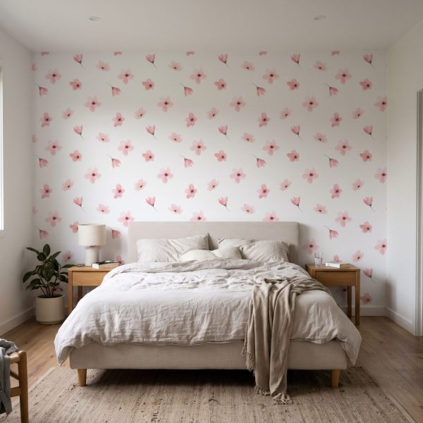
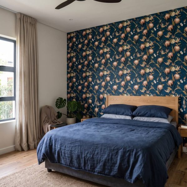
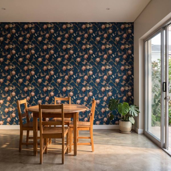
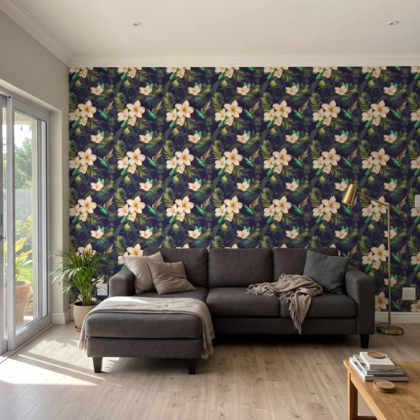
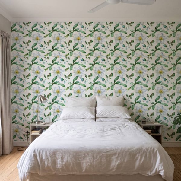
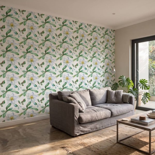
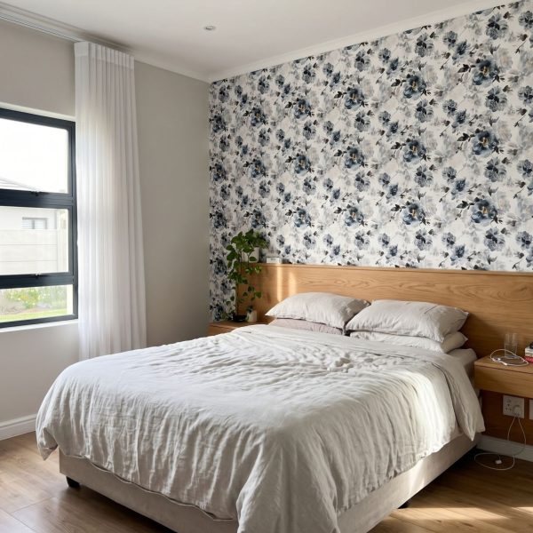
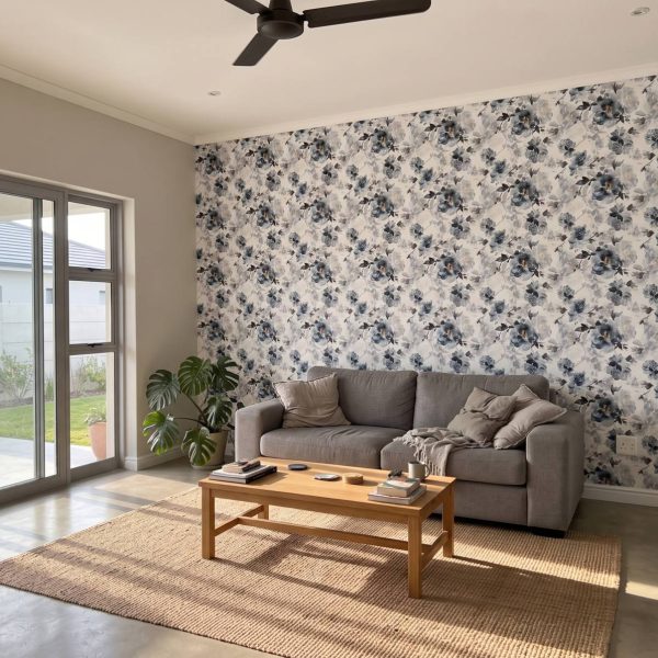
Clusters of large peony blooms and eucalyptus sprigs drift across the wall in washes of deep indigo, slate grey and white, painted with the soft bleed of real watercolour. The scale is generous enough that the flowers stay recognisable rather than turning into texture, so the effect reads as calm rather than busy. It suits a bedroom wanting a restful backdrop, or a living room corner meant to feel settled rather than lively.
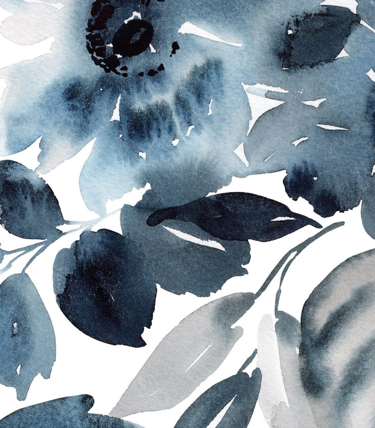
The design is built from deep indigo blue and softer slate grey over a white ground, with occasional near-black detailing in the centres of the flowers. Because blue is a cool, receding colour, it tends to push a wall back visually, which is useful for making a room feel less boxed in rather than more enclosed.
The peony clusters and leaves are painted at a generous scale, so a standard wall will show a handful of full repeats rather than many small ones. From across a room the flowers read clearly as flowers, not as texture, which makes this a good choice where the wall itself is meant to be noticed.
It is a loose, painterly watercolour floral rather than a flat or botanical illustration – the petals and leaves show visible bleed and brushwork, with tonal washes moving from pale grey to deep indigo and black. That hand-painted quality gives it a softer, more atmospheric feel than a crisp printed floral.
Blues are among the most forgiving colours for rooms meant for rest, which makes this a natural fit for a bedroom or a quiet reading corner rather than a space built for entertaining. The cooler palette settles rather than energises a room, so it suits walls you want to feel calm at the end of the day.
What reads as bold here is contrast rather than brightness – the deep indigo and near-black sit against a clean white ground, so the drama comes from tonal difference rather than a saturated hue. That makes it easier to live with on one feature wall than a bright colour at the same scale would be.
Available in Smooth Matte Peel & Stick, KOZO Textured Peel & Stick, NEW! ARTEX Canvas Peel & Stick, Traditional Smooth (glue required) and DuraMatte Fabric (glue required). For bathrooms and humid rooms choose a peel and stick or DuraMatte finish; Traditional is not suited to them.
| Weight | 2 kg |
|---|---|
| Dimensions | 980 × 50 cm |
| Materials Available | DuraMatte Fabric Wallpaper, Peel & Stick, Traditional Non-Woven Wallpaper |
| Is this wallpaper removable? | chipping and damage might occur. The traditional requires cutting, soaking and scraping to remove., The peel & stick materials are removable ( smooth matte peel and stick and KOZO. The DuraMatte will come off in one piece but dependant on paint and glue strength |
| Bathroom Friendly? | DuraMatte Fabric: Yes, Peel & Stick: Yes, Traditional: No |
| Application | DuraMatte Fabric: Requires wallpaper glue or paste, Peel and Stick: Self Adhesive-peel off backing Traditional: Requires wallpaper glue or paste |
| Delivery | 4-5 Working days for manufacturing and then approximately 2 working days for courier. |
| Pattern Repeat | Each panel comes in 60cm wide or 1.1m (wide format) panels. |
| Texture / Finish | DuraMatte Fabric: cotton canvas fabric texture / off white grey hue, Peel and Stick: soft touch matte / pure white., Traditional: paper matte / off white warm hue. |
| Washability | DuraMatte Fabric: Can be washed with warm water, gentle soap and a soft cloth., Peel and Stick: Can be washed with warm water, Traditional: Can be wiped. |
| Country of Origin | All wallpapers made in South Africa |
Only logged in customers who have purchased this product may leave a review.
Trustindex verifies that the original source of the review is Google. Trustindex verifies that the original source of the review is Google. Trustindex verifies that the original source of the review is Google. Trustindex verifies that the original source of the review is Google. Trustindex verifies that the original source of the review is Google. Trustindex verifies that the original source of the review is Google. 
Exclusive to Wallpaper Online the new ARTEX art canvas textured peel & stick gives artistic masterpiece energy to any space. -Commercial grade, textured PVC self adhesive wallpaper. -Waterproof & washable. -Repositionable & removable (DIY friendly).

- Commercial grade, textured PVC self adhesive wallpaper. -Waterproof & washable. - Repositionable & removable.
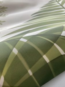
- Commercial grade fabric wallpaper. - Waterproof and washable. - Requires glue to apply.

- Soft touch smooth matte texture. - Peel & stick / self-adhesive wallpaper with backing paper (like a big sticker). - Waterproof & washable. -

- Traditional non-woven paper wallpaper. - Wipe-able but not waterproof or washable. - Requires glue to apply.
Enter the size of the wall you are covering in centimetres. Size in cm, e.g. 300 = 3 m.
Please add 10 cm to both width and height for flexibility during installation.
Preview the panels or add a note
Free room visualiser · 30 seconds · no sign-up
Get a 60 cm wide swatch of this design before ordering a full wall.
Not quite the one?
We recommend adding 10 cm to both width and height for trim flexibility.
Size in cm, e.g. 300 = 3 m.
How your mural is split into panels for printing. The price stays the same.
Receive a 60 cm wide sample of this design printed on your selected material. Perfect for checking the colour, texture, and quality before ordering your full wall.
Don't worry about being exact — we produce custom sizes so you'll get a perfect fit!
We've saved the room photo you used earlier — try this design in it.
We'll render this design in your space — photo-realistic, at correct scale.
JPG, PNG, WebP up to 12 MB · Result ready in 6–12 seconds
We're composing your design at the correct scale. This usually takes 6–12 seconds.
You've used your 3 free renders today. Pop in your details to unlock 17 more renders across any design, and we'll send today's previews straight to your inbox.

Reviews
There are no reviews yet.