- FREE DELIVERY ON ORDERS OVER R1000
- Working Hours: Monday - Friday: 9am - 4:30pm

We don't currently stock , but our team can help.
Leave your details and we'll send you some options.
✓ Thanks! We'll be in touch with options shortly.
We don't currently stock , but our team can help.
Leave your details and we'll send you some options.
✓ Thanks! We'll be in touch with options shortly.

EXCELLENT Based on 403 reviews
 Posted on Google
 Eleni SiebertProduct quality is exceptional, service is excellent and turn-around time is amazing!! Thank you so much! I will definitely make use of your company again!!Posted on Google
 Kerry Wilson
Trustindex verifies that the original source of the review is Google.
Great to recive affordable samples that gave clear picture of colours and patternsPosted on Google Mike BoldingVery happy with wallpaper received.Posted on Google
 Katherine KirkbrideWe have used them for two separate projects and customer service on each project was extremely good.Posted on Google
 Wilmari Van HeerdenWhat an awsome experience, super efficient and great quality. Thank you !!Posted on Google
 Nikhil ParshotamSuper easy to order online. Quick delivery. Instructions on how to DIY. Happy customerPosted on Google
 Lesley BestExcellent service and product! A very user-friendly site and super effective communication. The whole process was a joy from start to finish!Posted on Google
 A - catI used the peel and stick wallpaper to cover some lasercut mdf boxes I had made. I really liked the paper texture (kozo?) and it was incredibly easy to work with and match patterns where I wrapped around the boxes. The order and delivery process was also good and quite fast (I received the paper before the boxes arrived from lasercutting people). I think I might need to tackle a wall to match my little boxes now :)Posted on Google
 Sam de JagerAwesome service. Quick and friendly.
from
R289.00 incl.
| SKU | WPO_827-1 |
|---|---|
| Category | Floral Wall Murals, Cream & Neutral Wallpaper, Living Room Murals, Pink Wallpaper, Wall Murals Made in South Africa |
| Manufactured | South Africa |
EXCELLENTBased on 403 reviewsPosted on GoogleEleni SiebertProduct quality is exceptional, service is excellent and turn-around time is amazing!! Thank you so much! I will definitely make use of your company again!!Posted on GoogleKerry WilsonGreat to recive affordable samples that gave clear picture of colours and patternsPosted on GoogleMike BoldingVery happy with wallpaper received.Posted on GoogleKatherine KirkbrideWe have used them for two separate projects and customer service on each project was extremely good.Posted on GoogleWilmari Van HeerdenWhat an awsome experience, super efficient and great quality. Thank you !!Posted on GoogleNikhil ParshotamSuper easy to order online. Quick delivery. Instructions on how to DIY. Happy customerPosted on GoogleLesley BestExcellent service and product! A very user-friendly site and super effective communication. The whole process was a joy from start to finish!Posted on GoogleA - catI used the peel and stick wallpaper to cover some lasercut mdf boxes I had made. I really liked the paper texture (kozo?) and it was incredibly easy to work with and match patterns where I wrapped around the boxes. The order and delivery process was also good and quite fast (I received the paper before the boxes arrived from lasercutting people). I think I might need to tackle a wall to match my little boxes now :)Posted on GoogleSam de JagerAwesome service. Quick and friendly.
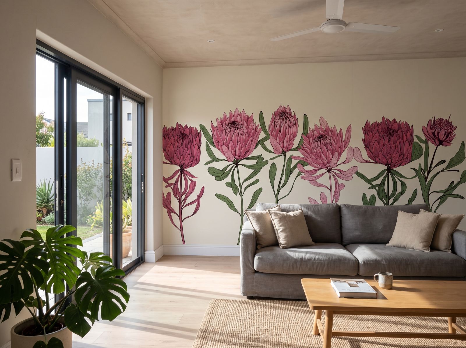
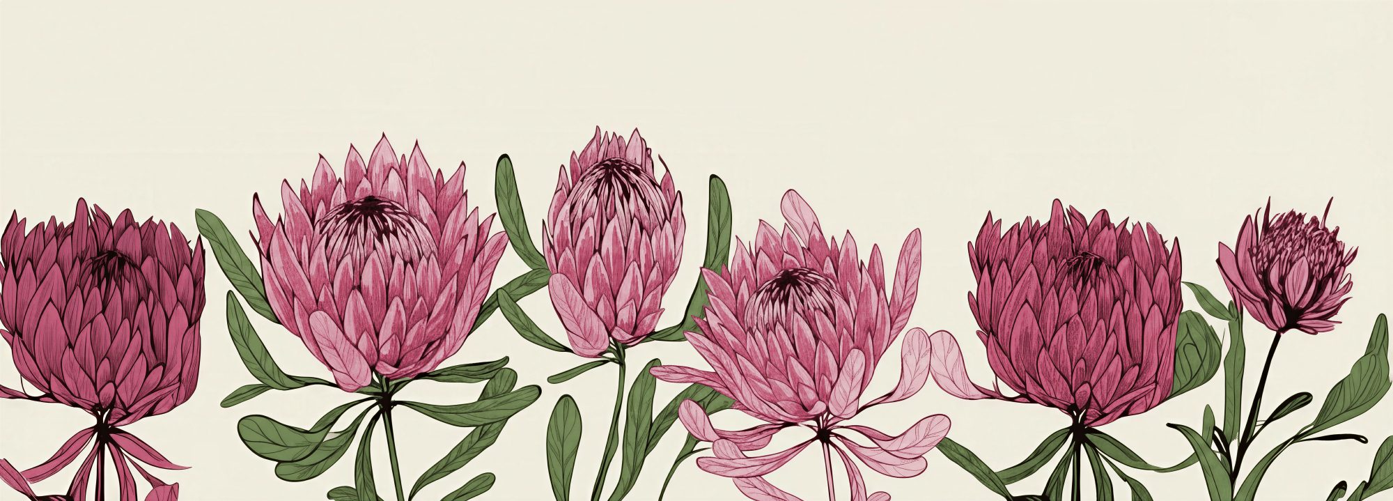
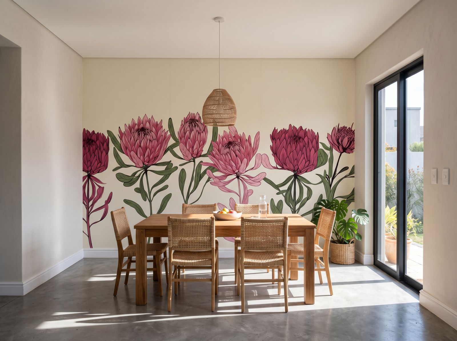
The design pairs dusty pink protea heads with soft olive-green stems on a warm cream backdrop. Pink reads as a muted, warm tone rather than a bright one, so it works well as the 30 per cent wall colour in a room, with the green easily picked up again in cushions or a throw.
The proteas are drawn as linear illustrations rather than photographic florals, with fine black outlines defining each petal and a flat fill of colour beneath. This gives the row a graphic, almost botanical-print quality that sits comfortably against a plain painted wall or alongside simple, unfussy furniture.
The protea row sits along the lower half of the scene, leaving the upper portion in plain cream. That openness means the mural can be hung so the flowers sit at furniture height, with the pale space above continuing the room's ceiling line rather than competing with it.
Pattern scale is judged against the wall it covers, not the room around it. On a wide feature wall the protea heads read as a clear, legible motif, while on a narrower wall the same artwork can appear more like texture because less of the design is visible at once.
Warm colours like this pink tend to advance, pulling a wall visually closer rather than pushing it back. That can be a useful trick in a long, narrow room to balance the proportions, though in an already compact room it may feel more enclosing than a cooler palette would.
EXCELLENTBased on 403 reviewsPosted on GoogleEleni SiebertProduct quality is exceptional, service is excellent and turn-around time is amazing!! Thank you so much! I will definitely make use of your company again!!Posted on GoogleKerry WilsonGreat to recive affordable samples that gave clear picture of colours and patternsPosted on GoogleMike BoldingVery happy with wallpaper received.Posted on GoogleKatherine KirkbrideWe have used them for two separate projects and customer service on each project was extremely good.Posted on GoogleWilmari Van HeerdenWhat an awsome experience, super efficient and great quality. Thank you !!Posted on GoogleNikhil ParshotamSuper easy to order online. Quick delivery. Instructions on how to DIY. Happy customerPosted on GoogleLesley BestExcellent service and product! A very user-friendly site and super effective communication. The whole process was a joy from start to finish!Posted on GoogleA - catI used the peel and stick wallpaper to cover some lasercut mdf boxes I had made. I really liked the paper texture (kozo?) and it was incredibly easy to work with and match patterns where I wrapped around the boxes. The order and delivery process was also good and quite fast (I received the paper before the boxes arrived from lasercutting people). I think I might need to tackle a wall to match my little boxes now :)Posted on GoogleSam de JagerAwesome service. Quick and friendly.

Exclusive to Wallpaper Online the new ARTEX art canvas textured peel & stick gives artistic masterpiece energy to any space. -Commercial grade, textured PVC self adhesive wallpaper. -Waterproof & washable. -Repositionable & removable (DIY friendly).

- Commercial grade, textured PVC self adhesive wallpaper. -Waterproof & washable. - Repositionable & removable.
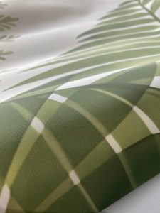
- Commercial grade fabric wallpaper. - Waterproof and washable. - Requires glue to apply.

- Soft touch smooth matte texture. - Peel & stick / self-adhesive wallpaper with backing paper (like a big sticker). - Waterproof & washable. -

- Traditional non-woven paper wallpaper. - Wipe-able but not waterproof or washable. - Requires glue to apply.
Enter the size of the wall you are covering in centimetres.
Please add 10 cm to both width and height for flexibility during installation.
Free room visualiser · 30 seconds · no sign-up
Get a 60 cm wide swatch of this design before ordering a full wall.
We recommend adding 10 cm to both width and height for trim flexibility.
Receive a 60 cm wide sample of this design printed on your selected material. Perfect for checking the colour, texture, and quality before ordering your full wall.
Don't worry about being exact — we produce custom sizes so you'll get a perfect fit!
We've saved the room photo you used earlier — try this design in it.
We'll render this design in your space — photo-realistic, at correct scale.
JPG, PNG, WebP up to 12 MB · Result ready in 6–12 seconds
We're composing your design at the correct scale. This usually takes 6–12 seconds.
You've used your 3 free renders today. Pop in your details to unlock 7 more renders across any design, and we'll send today's previews straight to your inbox.

Reviews
There are no reviews yet.